I recently built my own personal website.
Until now, I had been publishing pages using plain HTML, CSS, and JavaScript. However, I’ve been interested in Next.js, and this felt like the perfect opportunity to finally build a dedicated personal site. In this post, I'll share some of the technical details and design highlights of the project.
Tech Stack
The primary technologies and services used in this project are:
- Next.js (App Router)
- TypeScript / Tailwind CSS / React
- Sharp
- Vercel
Next.js (App Router)
Since this is a static website, I initially considered using Astro. However, I had never used Next.js—the most popular framework—so I decided to try it out first. By leveraging Next.js's Static Site Generation (SSG), the site achieves fast load times and improved SEO performance.
TypeScript / Tailwind CSS / React
Previously, I wrote raw JavaScript, HTML, and CSS directly. Moving to TypeScript, Tailwind CSS, and React has made the development workflow much more efficient and type-safe. Tailwind CSS in particular eliminates the need to constantly come up with class names, making styling concise and straightforward. In addition, React's component-based approach makes reusing code seamless.
Sharp
Sharp is a Node.js library for resizing and converting image formats.
Initially, I used next/image for image optimization. However, Vercel's free tier has a limit on image optimization requests. To avoid hitting these caps, I built a custom image optimization script using Sharp.
I plan to write a detailed post explaining this custom optimization pipeline when I get the chance.
Vercel
The site is deployed on Vercel. For personal, non-commercial sites, I consider it one of the best platforms available. Connecting it to GitHub allows automatic deployments on every push, making the process effortless. I also considered Cloudflare Pages, but ultimately chose Vercel for its seamless compatibility with Next.js.
Other Packages
- Shiki: Used for syntax highlighting in code blocks within blog posts.
- Motion: Used for animations in the gallery albums.
- Katex: Used to render mathematical formulas in blog posts.
- Mermaid: Dynamically loaded on the client side only when a post contains diagrams, keeping the initial bundle size small.
What I like
Header Logo Animation
I created a hand-drawn stroke animation by animating the stroke-dashoffset property on SVG paths.
Generating the paths required tracing over the font manually, and crafting smooth Bézier curves proved to be quite a challenge.
Gallery Albums
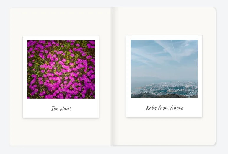
Simply displaying photos in a standard grid felt a bit plain, so I designed them to look like photo albums.
Adding photos is easy: simply drop the image files into public/images/home/gallery and register the metadata in galleryItems.ts.
Floating Menu
I designed the floating menu inspired by Apple's Liquid Glass aesthetics. Personally, while Liquid Glass looks great, it can be tricky in terms of usability, so I opted for a subtle frosted blur effect that feels elevated. Currently, it only links to the Home and Blog pages, but I plan to expand its functionality in the future.
Typography
All fonts used across the site are freely available on Google Fonts.
Rubik
Used for body copy on the homepage. I considered Inter, but felt it was a bit too utilitarian; I chose Rubik for its slightly more distinct, artistic personality.

Inter
Used for blog post text. Its high legibility makes it ideal for long-form reading.
Caveat
Used for photo titles in the gallery and on the 404 page. It's a charming handwritten font that works wonderfully as an accent.
Finally
There are still many features I'd like to implement, so I will share updates in future posts as new additions go live.